Guests at gatherings in London and New York were encouraged to talk, exchange ideas and share tables. After they left, Uncommon collected the traces they had deposited on those surfaces. Artist Dasha Plesen placed the samples in a growing medium; the resulting colonies became the visual language of OFFF Barcelona 2026.
Cultured was literally made from the people it addressed. As generative systems learned to produce ever smoother images and more plausible interfaces, the design industry began searching for qualities that resist instant reproduction: provenance, material evidence, a recognisable voice and a visible human decision.
The most important web-design trend of 2026 is therefore neither a colour nor a shape. It is a new answer to what creative work is worth once a beautiful first draft is no longer scarce.
The machine made the first draft ordinary
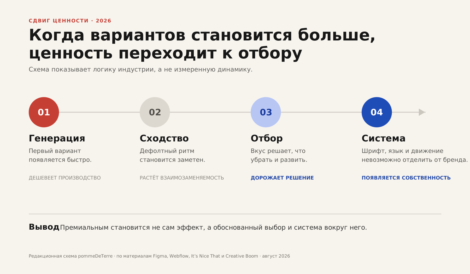
Generative tools compressed the most visible part of design work. A polished composition, advertising frame or landing-page prototype can now arrive before the first meeting ends. In a Creative Boom survey of more than 600 creative professionals, 330 respondents used AI tools while only 81 said they had not used them at all. Adoption, however, did not amount to trust.
Webflow identified visual sameness as a side effect of accessible production. As the average technical standard rises, brands can become easier to confuse: different covers wrapped around the same proportions, lighting, oversized phrases and rounded cards.
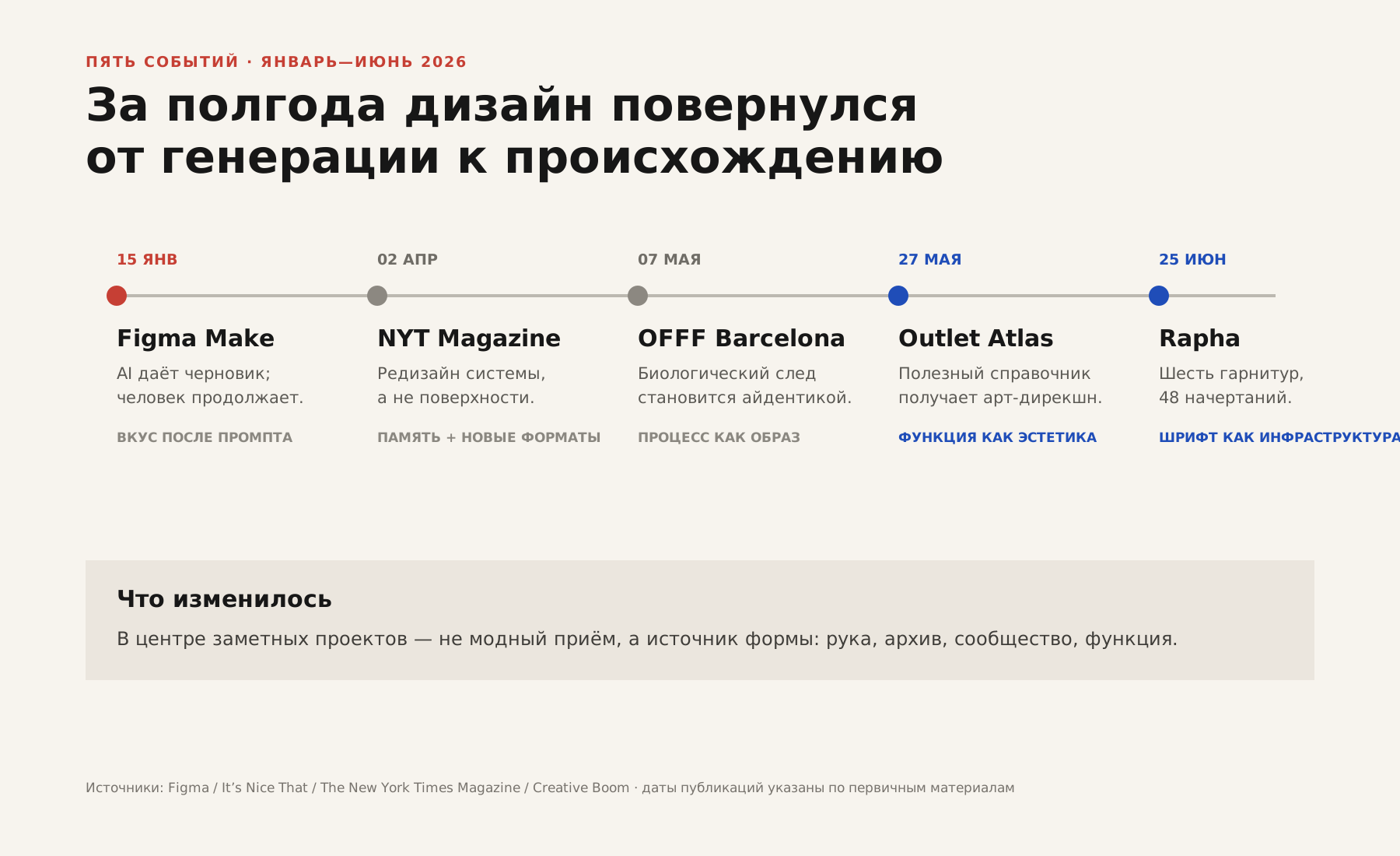
Figma made that tension the subject of its own campaign: “Prompt it. Then push it.” The hand remained at the centre of the image. AI could start the sentence; the designer was still responsible for deciding whether and how it should end.
Form has a biography again
Cultured moved in the opposite direction from instant generation. Its material was slow, unpredictable and only partially controllable. Mould can be copied as a surface style, but that copy loses the causal link that made the original meaningful: a festival describing culture as a living environment created between people.
This is more than another return of analogue texture. Grain, blur and an uneven line have already become digital presets. The human trace matters when it has a biography. Archives, local signs, production waste, employee voices and product data increasingly become the raw material from which a specific identity grows.
Old disciplines look radical again
The New York Times Magazine’s first major redesign in almost a decade did not seek novelty through rupture. Gail Bichler and Ben Grandgenett retained recognisable type, expanded the Cheltenham and Franklin Gothic families, refined the seven-column grid and reconsidered recurring editorial formats across print, web, audio and video.
Rapha followed a related logic. Six and Frost developed six type families across 48 styles after studying cycling magazines, race programmes, jerseys and technical manuals. Typography became infrastructure: it had to carry an emotional headline and explain a product specification with equal conviction.
After a decade of digital brands speaking in an increasingly neutral voice, letters are becoming the voice itself.
Beauty returned to the everyday object
Michael Romanowicz spent years considering an idea for a website about electrical sockets. Outlet Atlas, launched in May, pairs large drawings of plugs with clear tables and a disciplined grid. Small visual jokes give the catalogue character without making the answer harder to find.
Against immersive spectacles and generated imagery, a well-directed reference site can seem almost defiant. Its novelty is not technological. It is the conviction that useful information deserves art direction as much as a fashionable product does.
For corporate sites, healthcare, education and B2B products, this may be more important than any visual effect of the year. Complexity does not need to disguise itself as entertainment; it needs a structure worthy of the information.
The human remains the editor
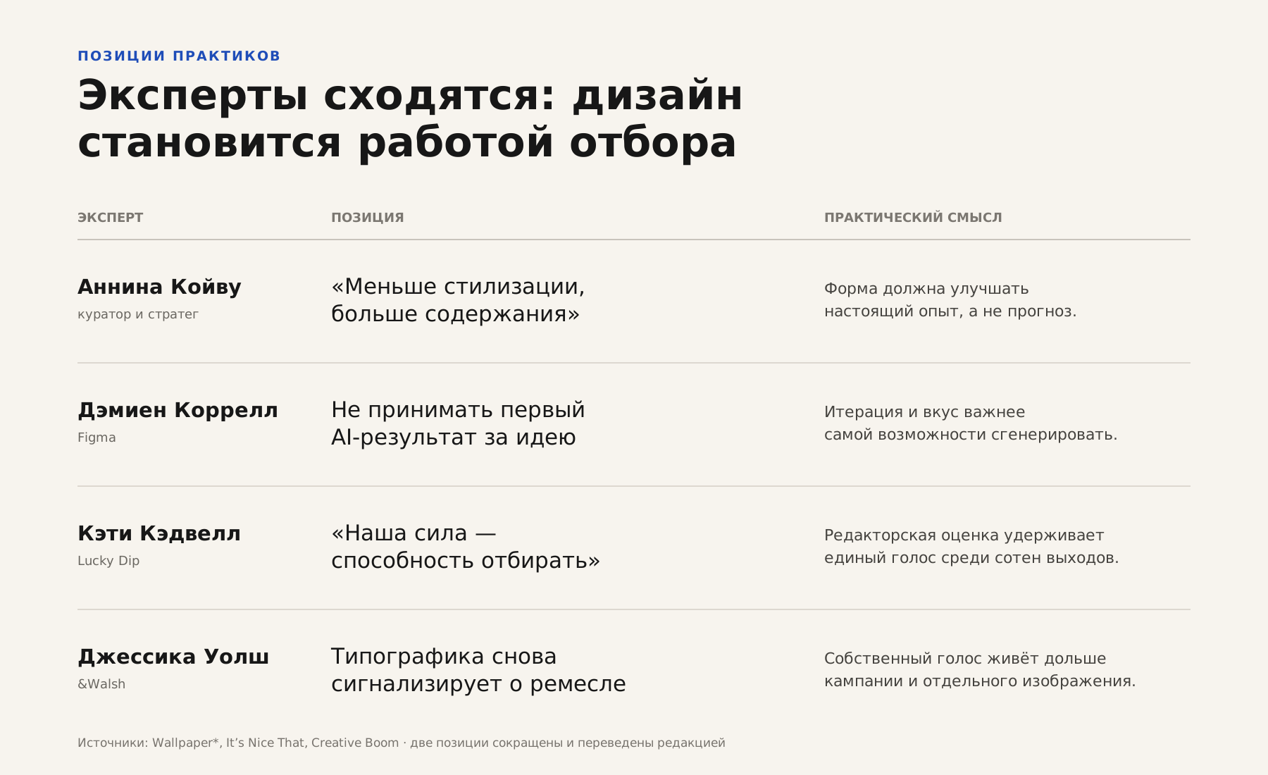
When Wallpaper* asked design leaders about 2026, their answers rarely concerned specific colours or forms. Anniina Koivu called for less styling and more content. Katie Cadwell, writing about teams caught between algorithms and generative production, returned to a familiar creative skill: selection.
That act of selection connects the year’s most significant projects. Figma separates a quick result from a developed idea. OFFF accepts unpredictable material because it expresses the community. The New York Times Magazine preserves institutional memory. Rapha builds a type system rather than a single campaign gesture. Outlet Atlas decides that even a socket deserves sustained attention.
What will remain after 2026
Trends are usually described as forms that can be named and repeated: maximalism, 3D, collage, unusual navigation. Those forms may appear everywhere and still vanish without changing the profession. The deeper shift concerns the distance between being able to make something and having a reason to make it that way.
For businesses, “make it look modern” is becoming a less useful brief. A contemporary surface is easy to reproduce and quick to age. Decisions rooted in a company’s history, product, voice, data or way of working tend to survive longer.
A machine can now produce the beautiful first option. A person must still explain why this is the option worth keeping.
A company can turn that principle into a concrete engagement by starting with one important page or user journey, testing its content and visual voice, defining rules for type, grids, imagery and interface states, and carrying those rules into responsive implementation. Such a pilot tests not only whether the design looks distinctive, but whether its language can support a real product.
Sources
- Creative Boom: survey of creative professionals in 2026
- Webflow: web design trends for 2026
- It’s Nice That: the Figma Make campaign
- It’s Nice That: OFFF Barcelona’s Cultured identity
- The New York Times Magazine redesign interview
- It’s Nice That: Rapha’s typographic system
- Creative Boom: Jessica Walsh on expressive typography
- It’s Nice That: Outlet Atlas
- Wallpaper*: design leaders’ predictions for 2026
- It’s Nice That: Katie Cadwell on creative selection