On August 25, CD PROJEKT RED introduced its refreshed visual identity. The symbol remains the raróg, a bird from Slavic mythology used by the brand since 2014. Its silhouette is simpler, its expression steadier and red has moved from an accent to the center of the system.
The change can look cosmetic: fewer lines and cleaner geometry. A mature brand faces a harder problem. It must remain recognizable to millions of players while working as a tiny icon, an exhibition wall, a motion sequence, a careers interface and material from studios on several continents.
The new mark does not try to forget the old one
The project collaborator is international design studio Mucho. In its project announcement, the studio describes the work as a refinement: the bird’s essence and direction remain, while its shapes are simpler and its presence stronger. The full case study is still to come, so conclusions about grids, typography and motion rules would be premature.
The published material does reveal the principle. The old raróg was expressive but contained many internal cuts and sharp details. The new silhouette holds together more readily at small sizes. That does not prove superior design by itself, but it is a coherent answer to a modern identity’s technical demands.
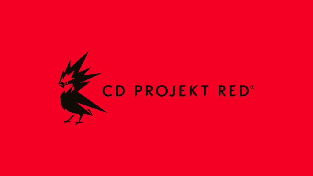
The bird still has a readable head, wing, tail and claws. Simplification has not turned it into a geometric checkmark. Attention is redistributed: the eye and beak form a clear entry point, large black masses assemble the body, and thin legs preserve a lively irregularity. The mark is less illustrative without losing narrative character.
That balance matters for a studio known for complex worlds and characters. A neutral mark would conflict with its authorial reputation; a highly detailed one would struggle at small digital sizes. The raróg sits between them: distinctive enough to stand alone and simple enough not to compete with game artwork.
Red became an environment, not a signature
Previously, red was chiefly associated with the name and selected parts of the mark. In the new presentation it occupies broad surfaces, with black and light tones working on top. RED moves from a word in the name to a repeatable visual condition.
That helps a global brand: color is read before language and needs no translation. It is also a commitment. The shade must preserve contrast and character on screens, packaging, stages and accessible interfaces. If it survives only on launch posters, it is not a system.
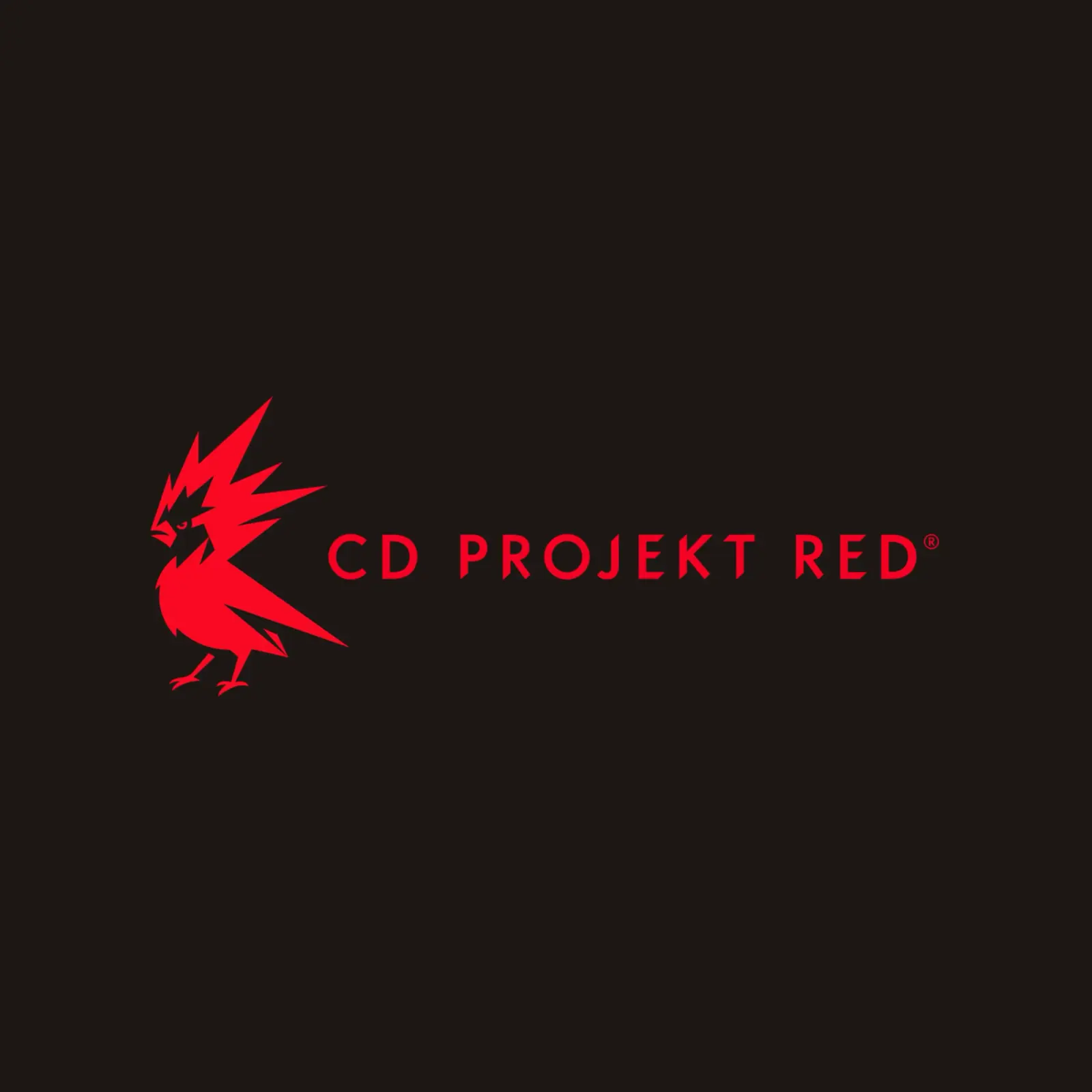
The dark version reveals the palette’s second role. Red can be the sign rather than the surface, while the identity stays recognizable without gradient, texture or game imagery. That reversibility matters for a brand placed over video, beside partners and inside employee documents.
The wordmark carries character rather than acting as a neutral label
The bird dominates the launch image, but the name handles an equally difficult job. Sharp cuts and uneven rhythm remain in the letters, supporting the raróg’s angles without copying them. This avoids the familiar redesign formula of an expressive symbol beside anonymous geometric type.
The widely spaced wordmark works on a broad canvas and gives the bird room. A narrow screen will need another arrangement — likely a stacked lockup or the symbol alone. No complete guide has been published, so the launch images demonstrate range without revealing minimum sizes or exclusion zones.
For international use, the larger typography system matters more than the fixed Latin wordmark. Polish, English, Japanese and Russian headings may require different fonts; the rules must preserve the brand voice beyond the letters CD PROJEKT RED.
Simplification does not have to mean anonymity
Corporate redesigns are often criticized for interchangeable geometric type and lost detail. CD PROJEKT RED has a defense against that risk: the asymmetrical raróg and its directed gaze remain unusual assets tied to the company’s origin and name.
The new mark feels mature not because it looks harsher, but because it relies less on fine lines and effects. It can be more confident in motion, at small scale and in tight layouts. Recognition comes from the contour and tension of the shape, not the number of feathers.
A large JPEG is not a sufficient comparison. Old and new marks should be placed in a 32-pixel avatar, mobile navigation, a trailer end frame, an employee badge and an exhibition wall. The test is not taste but eye and silhouette legibility, contrast, distance from neighboring marks and recognition time.
The refreshed logo earns its simplicity only across those uses. If the bird reads faster at small size, the removed details were noise. If its character disappears, presentation cleanliness came at too high a price.
The identity must coexist with The Witcher and Cyberpunk
The CD PROJEKT RED corporate brand does not replace its game brands. The Witcher inhabits historical texture and a restrained palette; Cyberpunk uses yellow, neon and technical typography. The studio’s red system must identify the maker without painting every universe in one corporate color.
The hardest surface is therefore not a sparse business card but a shared screen: trailer, team vacancy, support page or investor presentation. The studio mark must be visible without becoming a third visual world beside the game and platform.
A simpler raróg could solve that problem as a small signature without demanding its own illustrative zone. For now that is an inference from the form, not a demonstrated rollout result. Real post-gamescom pages and campaigns will supply the evidence.
The real test begins after the launch deck
For now, the evidence consists of the company announcement, press materials and Mucho’s short account. That establishes intent, not the quality of the whole system. The mark still has to coexist with the distinct worlds of The Witcher and Cyberpunk, localized typography and ordinary communication templates.
A company planning its own refresh can follow a practical sequence: inventory real touchpoints, test recognition and contrast, define color and type rules, implement them in working pages and inspect multiple screens. A logo can be approved in one presentation; an identity becomes a system only through hundreds of consistent uses.
- Collect live pages, documents, avatars, video and physical surfaces rather than presentation mockups.
- Test the mark at minimum size, on light and dark fields, in motion and beside product brands.
- Define typography for every working language, accessible color combinations and compact lockups.
- Audit real material after launch and fix templates that force teams to work around the system.
CD PROJEKT RED chose a notably calm route: the new raróg does not ask the audience to forget the old bird. If later applications deliver the promised adaptability, the redesign’s achievement will not be a new outline. It will be allowing a familiar image to stop fighting the formats in which it has to live.