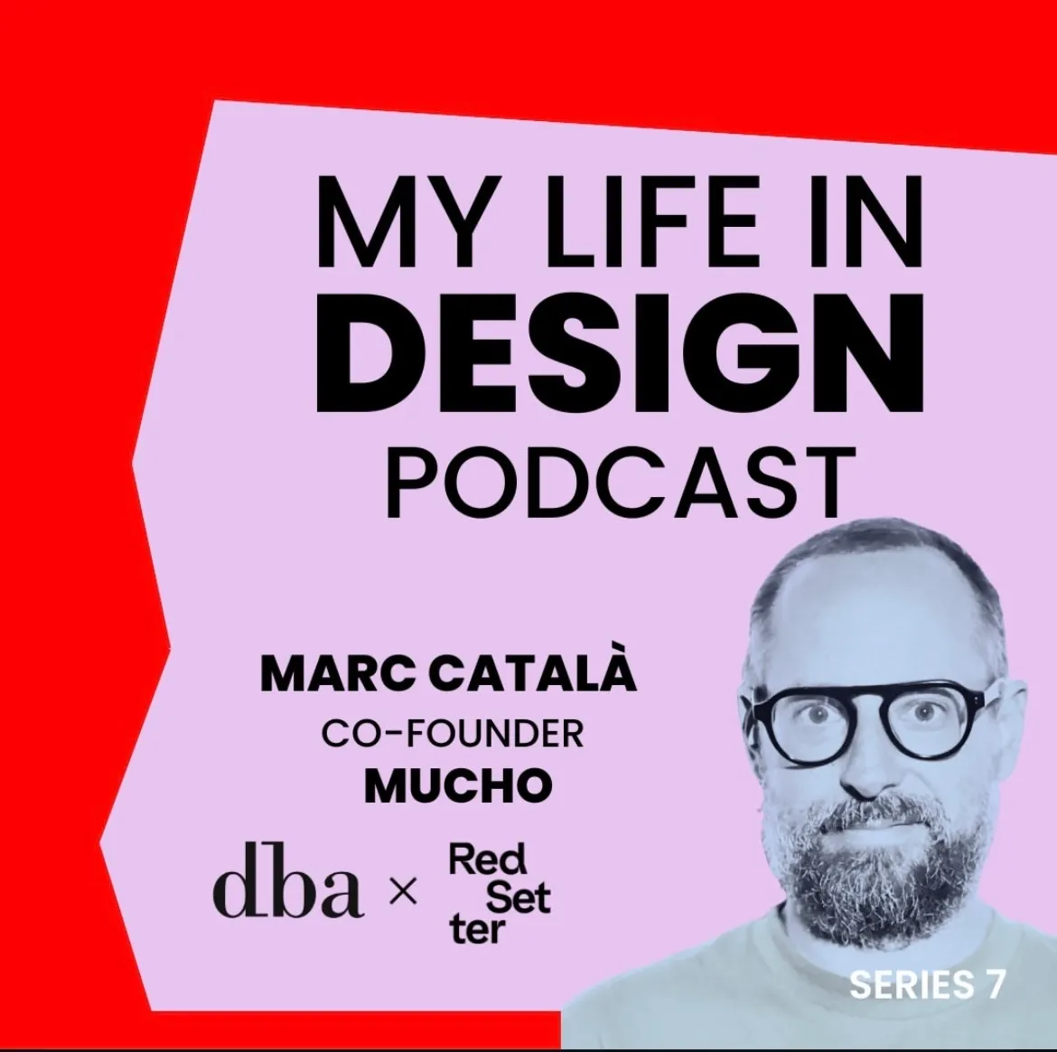
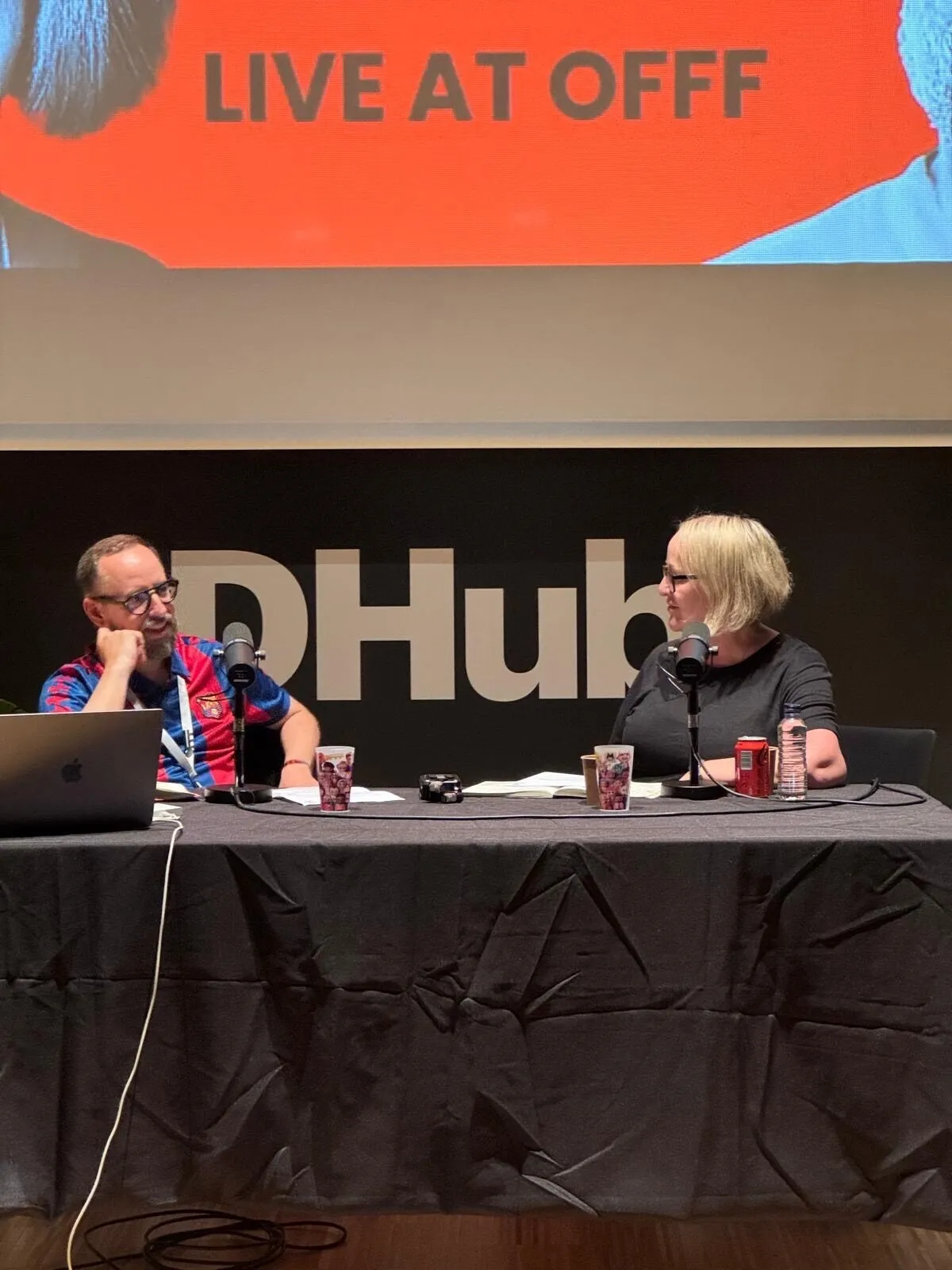
In spring 2025, Marc Català sat on an OFFF festival stage in Barcelona beneath an enormous My Life in Design sign and recalled his mother taking him to exhibitions he had no desire to visit. He now does the same to his own children. The audience laughed, but the family loop contained Mucho’s story: design arrived slowly, through resistance, work and the people nearby, rather than one moment of revelation.
By then, Mucho was an international studio with partners on both sides of the Atlantic. A year later its name appeared beside CD PROJEKT RED. Yet Mucho is not the alias of a famous designer. It is the deliberately impersonal name of a collective that grew from Marc Català and Pablo Juncadella’s friendship and learned to turn disagreement into a way of working.
Before the studio came newspaper fever
Català wanted a creative career but feared a designer had to draw well. In a long Eye magazine interview, he remembered entering Barcelona’s EINA school and almost immediately finding drawing on the timetable. Typography offered another route. The youth supplement El País de las Tentaciones showed him that a newspaper could speak through type as expressively as a poster.
Català and Juncadella joined Grafica, working with the supplement’s creators Pablo Martín and Fernando Gutiérrez. School continued after class, now with real fees and real deadlines. During an El País redesign, the two young designers worked from an apartment in one of Madrid’s tallest buildings. Català would later describe the period in two ways: extraordinarily prestigious for the 1990s and almost unbearable in its intensity.
Pentagram in London followed, along with Català’s creative direction of The Observer. A week fractured into London, Barcelona, pages, flights and corrections. Editorial design taught the future Mucho something absent from a beautiful presentation: a system must survive the next issue. If it works only in its author’s hands, it is not a system.
The name was nearly Ping Pong
The desire to return to Barcelona eventually outweighed the security of London’s design machine. According to Català’s OFFF account, the future studio gathered around Pablo’s kitchen table. The founders were in their twenties and surrounded by industry heavyweights; they felt like “kittens among lions.” Even the name resisted them: Ping Pong was one candidate.
The official biographies differ by a year: Juncadella’s gives 2002, Català’s and Eye give 2003. The calendar gap matters less than their position. Clients were scarce, fees low and confidence thinner still. They accepted nearly everything because each commission offered another chance to understand the profession beyond Pentagram.
The first serious test was not an airline or museum but chocolate. The Chocoa brothers mixed cocoa with spices and even anchovies; Mucho had to produce twenty new wrappers every two weeks. Around a kitchen table, one idea can be debated forever. A chocolate production line forces a decision about what remains constant across a series and where play is allowed. Work like this turns taste into method.
They argued so fiercely that colleagues expected a fight
At Pentagram, colleagues mistook Català and Juncadella’s conversations for rows. They considered them friendly discussions. The habit could have broken the partnership, but instead protected it: an idea received no special treatment because it belonged to a founder. Català later drew a simple boundary — disagreement is useful until it becomes personal conflict.
That is why the studio became Mucho rather than Català & Juncadella. The name did not reserve the final word for two people and left room for future partners. Tilman Solé joined in 2010, bringing a missing layer: strategy. The conversation could now begin not with whether a form looked right but with the business problem it had to solve.
A riskier expansion came in 2013 when Mucho joined forces with the Anglo-American Duncan Dowling. Rob Duncan, whose path included Pentagram and Apple, led San Francisco. This was not a branch opening from a finished manual. Old acquaintances combined independent practices and agreed to share authorship across distance, when video calls and large file transfers did not yet feel like a studio’s natural habitat.
The pandemic tested whether the collective was real
Dominic Hofstede joined in March 2020 to build Mucho’s Melbourne team. He returned from Barcelona to Australia expecting a fresh beginning and was almost immediately locked down. In an interview about that period, Hofstede said the initial “let’s go for it” became simply “let’s get through this.”
The distributed model then had to become more than presentation copy. A small Melbourne team could reach people who had already encountered a similar problem in San Francisco or Barcelona. Its first large Australian commission, the Art Gallery of New South Wales identity, was made with the gallery’s internal designers. The agency did not carry the answer away: the people who would use the system every day helped build it.
Hofstede compared the old agency model to theatre: disappear for a month, enter with presentation boards and hope to amaze the client. Mucho chose a less dramatic route — show unfinished work, listen to those who must implement it and let them alter it. The reveal loses some magic; the identity gains a better chance of remaining alive.
Why CD PROJEKT RED’s familiar bird survived
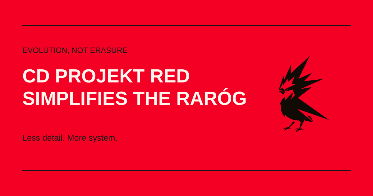
In 2026 that method met a brand with millions of attentive owners — its players. The CD PROJEKT RED refresh could easily have become another corporate simplification: remove the complicated mark, add neutral type and announce a new era. Instead, the raróg kept its direction, beak, claws and nervous character.
Mucho says it worked with the internal CD PROJEKT RED team to preserve the brand’s essence while making its presence simpler and stronger. The full case study is still pending, so individual decisions cannot responsibly be assigned. The move is nonetheless recognizable: do not impose an agency signature; find what in the existing image can survive the next format.
The newspaper background matters more here than a fashion for minimalism. The old symbol behaved like a complicated illustration; the new one must work like a headline — gathering attention quickly and holding together when reduced. Red became the environment rather than decoration. Mucho was again solving the chocolate-wrapper problem: what repeats every time, and where can an individual product remain free?
A studio without a single person in charge
Mucho now has eleven partners. For the studio, that is not a collection of impressive names but an admission of something simple: a designer in Barcelona need not be the best person to understand a Sydney museum, a San Francisco technology company or a Polish game studio. A project brings in the experience the others lack, much as strategist Tilman Solé once entered a conversation between two designers.
Català talks often about arguments inside Mucho, but not as a romantic story about creative chaos. An argument earns its keep only when it leaves behind something usable: a name, a mark or a system the client can operate without the studio. That is why Mucho does not build projects around one art director’s recognizable hand. The client should remain recognizable.
The new CD PROJEKT RED mark shows the approach without needing an explanation. Mucho did not give the company a different bird or leave its own signature on the work. It opened the silhouette, removed fragile details and kept the old raróg’s character. The author of the change is barely visible; the mark finally is.