Design
Identity, digital interfaces and the work of design studios
Journal topics
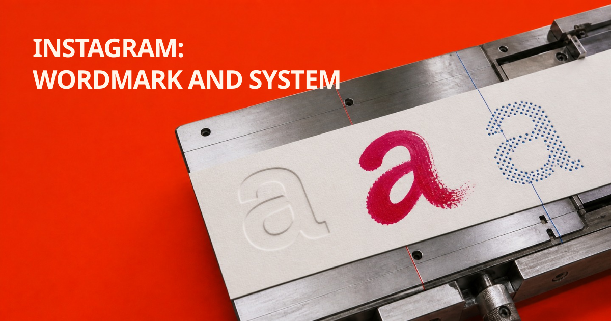
Instagram changed the word, not the icon: how its new type system works
The most visible change is a script wordmark that the internet read as “Instagzam.” The more useful story is the system around it: a steady Sans, the upcoming Pen and a new Sans Mono each have a different job.
CD PROJEKT RED simplified the raróg: why a mature brand needs less detail
The studio kept its bird of prey, removed visual noise and made red a system color. This is not a dramatic rejection of the past, but a lesson in preparing a mark for more screens, languages and products.
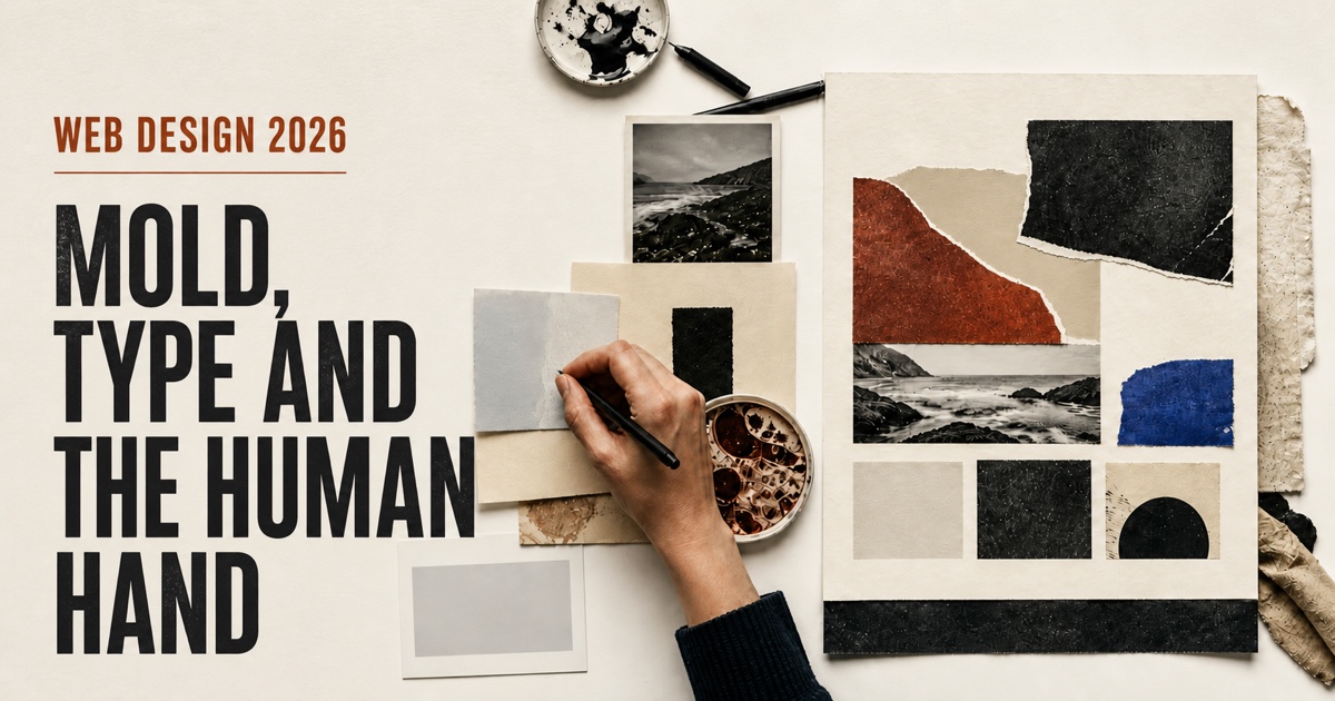
Mould, type and the human hand: why web design is tired of perfection
Generative tools can produce a beautiful first draft in minutes. Designers are responding with living materials, archives, distinctive typography and a renewed respect for useful information.